Friday, 11 March 2011
Final evaluation
• In what ways does your media product use, develop or challenge forms and conventions of real media products?
The key ingredients of my magazine are mainly the colour scheme, the typography and the content. This is mainly to determine the magazine, make it eye catching and also make it an interesting read. The front cover has to include:
Masthead- this is so the reader can determine what this magazine is.
Cover lines- This is to interest the reader and make them buy the magazine because of what's inside.
Banner- This is another way to persuade a reader to buy the magazine. for example mine was "The best music magazine in the country."
Image- The front cover also has to include at least one or two images. This is also to persuade the reader to buy the magazine and to make them interested.
Date ad title
Bar code
colour- The colour is there to make it look good and make it look eye catching so a customer would notice it in a shop.
A typical contents page and double paged spread usually contains all of above apart from the Banner, date, title and bar code. The contents would also have a list of pages to direct the reader where to look for a specific page and the double paged spread also contains either a questionnaire, interview, facts etc. to interest the reader. I have made sure that I have included all of these conventions within my magazine because I feel that it needs to look professional and as much like a magazine as it possibly can. I don't think that I have done much differently but I have used the same colour scheme throughout the whole magazine which usually doesn't happen... However, in this case, I feel that it works and it gives it a little originality. I think I have pushed the boundaries a bit on my magazine as I feel that I have loads of unusual but amazing fonts whereas a normal magazine uses only one or two fonts. I think that this worked extremely well as once again it gave it originality and made it look that little bit more interesting.
• How does your media product represent particular social groups?
 The social group that I think I have represented are teenagers aged 15-20 that like rock music, mainly because the type of music involved within this magazine is to do with their generation. I have represented them by adding in rock stars within their age range for example, Misty Prophet. And I have also added in things that they would enjoy within the magazine like quizzes and activities. I have used young people for the images that will encourage younger people to buy it as they can relate to them, I especially like the front cover image as it will immediately catch young readers eyes. Lastly I think that I have used language that teenagers will understand. For example, I haven't used big words that only older people will understand, I have used modern day easy language that younger people will understand.
• What kind of media institution might distribute your media product and why?

The publisher Bauer Consumer Media already publishes magazines just like mine for example "Kerrang!" Kerrang! is like my magazine because:
Its a music magazineIts genre is mainly rock
Its age range is the same as mine
And it contains latest news on all the latest artists.
I think that a company would like to publish my magazine because it offers so much entertainment like:
latetest images
latest information
interviews with big rock stars and bands
questionnaires
Its presented well, eg. the images are chosen well, the colour schem is eye catching and the fonts are interesting and link in with the genre.
However, if they were to publish my magazine it may need a few last minuite touches.
Who would be the audience for your media product?
As i said previously my audience would be for teenagers who are interested in rock ages 15-20 years. I also think that it is for male and female as it contains both male and female artists (Misty Prophet and Green Day) Also again, I have adden in information, entertainment, images and used language that would mostly appeal to them.
• How did you attract/address your audience?
I used a wide range of techniques to attract and address my audience, for example:
Colour- I used bold colours such as Purple, black and white. I feel that these colours compliment each other nicely and stand out next to each other, these colours were a great choice. I also think that they link in with the whole rock theme and will appeal to my audience.
Cover lines- I feel that the coverlines worked very well as its short and catchy, “Interview with Misty Prophet.” I thought that this worked really well and attracted the readers
Masthead-Lastly the Masthead, I feel that the title is an important part in catching the readers eye, so I used a big bold font in Puple on a black background. This worked really well as it stands out and is very eye catching. I really like the font that I used as it is unusual and links in with the theme
Images- The images were also a main part at attractingthe readers, so I got an image of young people a long with 'Misty Prophet.' So that the audience will be interested with it and can relate to them all. I also changed the styles of the images on gimp for example I gave the main image a cartoonised effect wich worked really well. I think that all of these points would make the audience want to buy my magazine.
I have asked a few people what they think of my magazine and this is the feedback I got:
1. I really like the use of the colour, The black and purple go together well I also like the font. I also like how it looks very proffessional.
2. I like the use of colour and how you added in every little detail that is needed for a music magazine. I think that you created this in an amazing way and that it looks very creative.
3. I love how originall your pages look, I especially like how the colours work together and that you use different type of fonts throughoyut the whole magazine, I also like what you have added in the contents as that would deffinately persuade some one to buy it. Lastly, my faviroute pge has to be the double paged spread as I love the image and the colour scheme, and I also love the idea of using an interview.
What have you learnt about technologies from the process of constructing this product?
 Within this project, I have learnt so much more about magazines. I have learnt what all the different parts of a magazine such as masthead and cover line. And I also learnt how to make your magazine a lot more presentable, appealing and persuasive. I have also learnt more about using publisher and gimp and this will help me later on in life if I do anything like this as a career.
• Looking back at your preliminary task, what do you feel you have learnt in the progression from it to the full product?
I have learnt so much during the progression to the full product. For example, I have learnt to make my work look presentable and proffessional so that it appeals more to the target audience. I have also learnt how to present it, by putting the title and images in certain places. I think that theses skills will be so uefull later on in life.
To create this magazine cover and contents, I used the following technologies:
Gimp- This was really helpful to change colours and to add in the images, if I never used this then my final pages would deffinately not be up to thehigh standards that they are at the moment.
Digital camera- I used this to take all the pictures for my magazine, this was extremely usefull.
Publisher- I used this to create the layout of the designs and to make sure that they worked well.
 Within this project, I have learnt so much more about magazines. I have learnt what all the different parts of a magazine such as masthead and cover line. And I also learnt how to make your magazine a lot more presentable, appealing and persuasive. I have also learnt more about using publisher and gimp and this will help me later on in life if I do anything like this as a career.
• Looking back at your preliminary task, what do you feel you have learnt in the progression from it to the full product?
I have learnt so much during the progression to the full product. For example, I have learnt to make my work look presentable and proffessional so that it appeals more to the target audience. I have also learnt how to present it, by putting the title and images in certain places. I think that theses skills will be so uefull later on in life.
Conclusion
Overall, I feel that this project was very successful and worked really well, I really like the use of colours that I used on my pages (black white and purple) I think that these colours really compliment each other nicely and link in perfectly with the whole rock genre. Also the images, I feel that I chose perfect images for my magazine as they really stand out and will appeal to the younger generation as they are of young people.Lastly, I really love the font as I used a load of different types all bold and all interesting, I did this so that it wouldnt look too uniformed.
If I was to do this again, I would maybe add in a few more images, experiment more with colours and fonts and try a load of different layouts, to see if I can get it looking any better.


Wednesday, 9 March 2011
final front cover draft

Friday, 4 March 2011
draft for final double paged spread

Please comment and tell me what you think!! :)
My first images
Image one
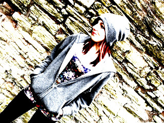
 This is a image of Charlotte worley that I have taken for my double paged spread. I really like this as she looks rocky which means she links in with the whole genre of rock! I also like We setting as she isn't by a usual boring brick wall.... she is in front of an eroding brick wall made of "rock." I also think that the dark grey colours go well with the bright colours for example her hat and jacket goes well with the colour of her hair and top. I think that this would go well in my final but I feel that if I were to make it better I could edit it on gimp.
 This is the image of Charl, but I edited it on gimp. I really like this as I enhanced the image and the colour contrast. I think that this works really well and would be great for my final double paged spread, as it is very eye catching and looks modern and Rocky which links in with the theme "modern rock."


Subscribe to:
Posts (Atom)