Saturday, 11 December 2010
Friday, 10 December 2010
evaluation
• In what ways does your media product use, develop or challenge forms and conventions of real media products?
Within my evaluation I added forms and conventions of real media products such as a:
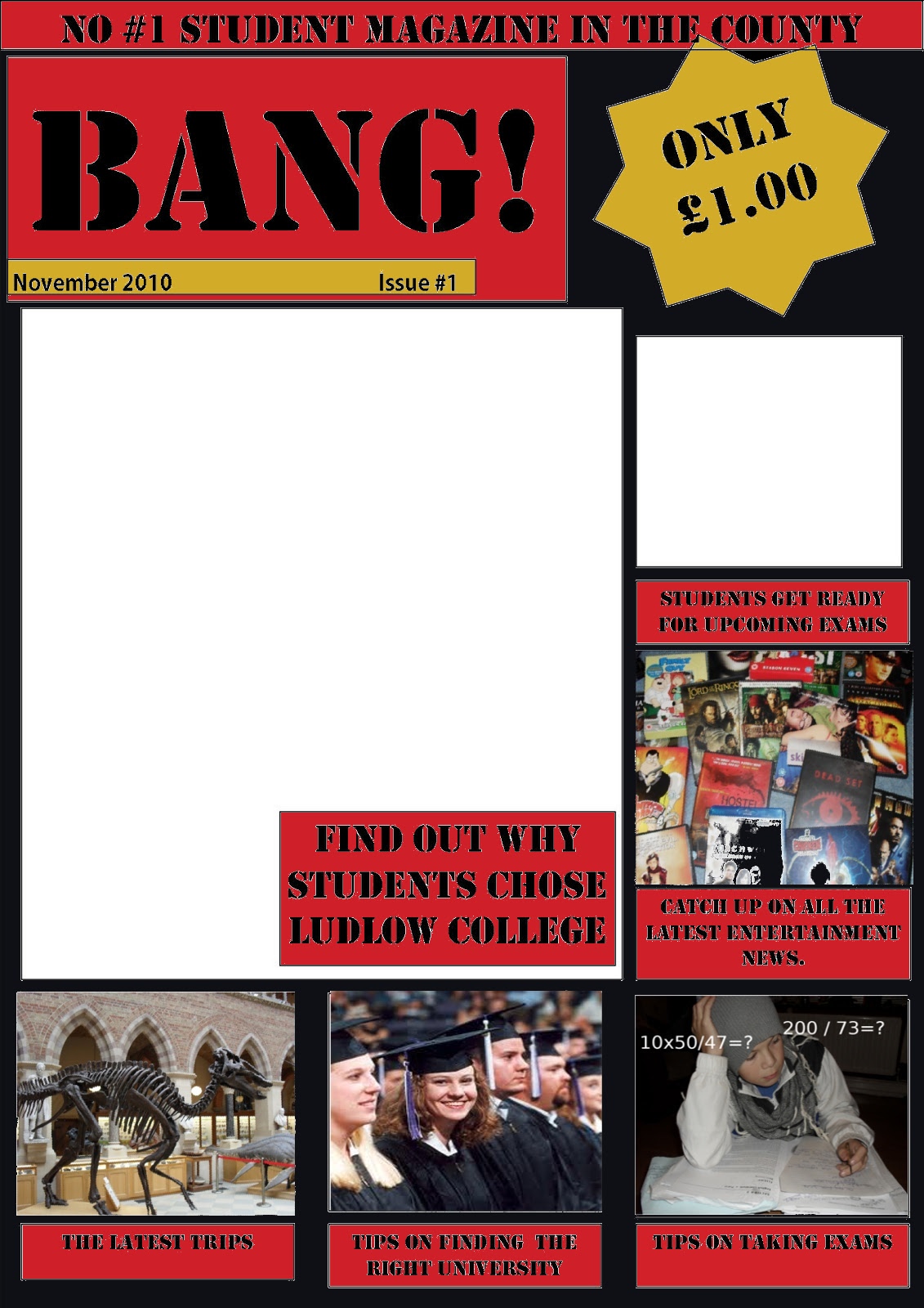
Masthead-I feel that this is a vital as it involves the name and identifies the magazine. My masthead on my front cover worked really well as I used big bold lettering (stencil) in a bold black and I put it in a red box which also helped it to stand out.
Cover lines- I put a load of cover lines in my contents and front cover as I also thought that this is vital, I put cover lines such as “Tips on taking exams” “catch up on all the latest entertainment news” and “new students.” I put these here to advertise what’s inside and make people more interested and buy the product. I feel that these are very good cover lines. To create them I used stencil font in black to link in with the title, I also had a red background to make it stand out.
Images- within my pages I put loads of images, I had a lot of trouble trying to find the perfect ones but I got there in the end. I feel that my pictures worked very well as I edited some on “gimp.” However I feel that there are too much images and if I were to do it again, I would take some away.
Colours- I used the same colour scheme for both my front cover and contents, I thought the colours red, black and gold work perfectly together and compliment each other nicely, however I feel that I should maybe add in more colours.
Editorial- in my conclusion, I added an editorial. I think that this was a good idea as it gives you an introduction to the magazine and says exactly what the magazine involves.
In my magazine, I feel that I added all the main aspects of a magazine and it worked really well. I also feel that its more informative than a normal magazine.
• How does your media product represent particular social groups?
I think that in my magazine, I have represented students and teenagers. I have done this by the ues of stereotypical images, for example… I have images of students who other students can relate to, I feel that pictures of students are extremely vital for a student magazine as it helps the audience determine who the magazine is actually for and what age group. I have also added pictures of movies and TV series that students would be most likely to watch, this would be eye catching to the viewer and make them want to open it and read up on it. Lastly, the language used. I have used language that would appeal to younger audiences and not too complicated words, this makes it more enjoyable and much easier to read for students whereas if it contains long, boring, confusing words it wouldn’t be enjoyable. Also the title is very eye catching and a great word to use for a student magazine “BANG.”
• What kind of media institution might distribute your media product and why?
The distributions that already publish magazines like mine are, magazines like “STUDENT ID” and “ etc.” I got some of my ideas form these two magazines as I thought that theuy were great and helpful, but the student id one never had much information and wasn’t very eye catching, which I made sure mine was. I think that a company would like to distribute my magazine because its eye catching, it offers a lot for students, its enjoyable and its very cheap to buy, which would bring more customers to buy it. I did a analysis on a “student Id” magazine from our college, and I feel that mine was a lot better, as it contained a lot more images and information. I feel that these are the two vital thing for any magazine front cover and contents page.
• Who would be the audience for your media product?
I think that my magazine would be more suitable for students aged 16-18, male or female, as I feel that my magazine provides information for both genders, we have both genders in our college, so I think that both would be more suitable.
• How did you attract/address your audience?
I used a wide range of techniques to attract and address my audience, for example:
Colour- I used bold colours such as red, black and gold. I feel that these colours compliment each other nicely and stand out next to each other, these colours were a great choice.
Text- I feel that the text worked very well as its short and catchy, “Tips on taking exams.” I thought that this worked really well.
Title-Lastly the title, I feel that the title is an important part in catching the readers eye, so I used a big bold stencil font in black. This worked really well.
• What have you learnt about technologies from the process of constructing this product?
To create this magazine cover and contents, I used the following technologies:
Gimp- This was really helpful to change colours and to add in the images.
Digital camera- I used this to take the pictures.
Publisher- I used this to create the layout of the designs.
Within this project, I have learnt so much more about magazines. I have learnt what all the different parts of a magazine is and also how to make your magazine a lot more presentable, appealing and persuasive.
AUDIENCE FEEDBACK!!!
"Really like the colour scheme, very bright and youthful and the colours go well with the pictures"- vcarpenter93
I found this quote very helpful as it told me whatsgood about my design
" I like it, but shouldn't experiment with more fonts." vcarpenter93
I also found this helpful as I did experiment with more fonts and it made it look a lot more presentable.
Conclusion
Overall, I feel that this project was very successful and worked really well, I really like the use of colours and images, also the font is very effective.
If I was to do this again, I would maybe add in less images, experiment more with colours and fonts and try a load of different layouts.

Final contents page :)

This is my final contents page.
Within this I added relevant pictures, a banner, I also added an editorial as i thought that was needed within the contents page...
Sunday, 5 December 2010
colour idea 1
 |
| Please tell me what you think of the first colour scheme Idea Please tell me if you have any other Ideas Thankyou :) |
Image 2
 |
| This is a picture I took for the part "Tips on taking exams." I feel that this is a good picture, but don't think that its good enough so i changed it on "Gimp".... |
 |
| This Is the second version of this image. To change this one I added sums with ?? at the end to show that he is struggling with the questions and to highlight the fact that the tips in this magazine will help a lot. I think that this image works really well and is very effective. |
Images 1
 |
| This Is the first picture that I too and didn't really think that it worked too well as its too far away and its not light enough. |
 |
| So I created another, this one was much closer and I also cropped it so the whole image will be of the DVD's and not any background. I feel that this image goes with the headline " catch all the latest entertainment news." As this contains well know and popular Films and TV series such as The Lord of the rings, The Pirates of the Caribbean, The shawshank redemption, True blood and Family guy |
A few of the pictures on.

I haven't put all the pictures that I have taken on the design yet.
Friday, 3 December 2010
colour scheme!
Im not quite sure what colours I should use and think I should wait until I get more pictures on incase it looks too crowded.
If anyone has any ideas please leave a comment,
Thanykyou :)
If anyone has any ideas please leave a comment,
Thanykyou :)
Wednesday, 1 December 2010
contents page re-done!

I also made the contents headings bigger and made them bolder so that they stand out a lot more.
Post a comment and tell me what you think, nd whether its better than my first draft.
My final draft for my contents page

I really like how this has turned out as it contains a load of information, a editorial and a contents.
If I had to choose something that I dont really like it would be thta there is too much writing.
All I have to do now is get some pictures put them in the boxes and also do the colours, but im not sure what colours I should use....
If anyone has any colour ideas please post a comment and post what you think of this.
Thankyou
Friday, 26 November 2010
My First draft for the final design

This is my first draft for my final design for the front cover of my student magazine.
I am really proud of how this came out and I also love the layout as it looks just like a magazine.
If there was something wrong with this one I think that there is too many pictures involved an there isn't usually this uch on normal front covers.
All I have to do now is change the colours and add in the pictures this will make it look a lot more effective and more like a magazine.
Please comment on this and say what you think!
Please leave a comment!!
Please post a comment on the Front page and the contents page that you would like to see as my design.
Thankyou :)
Thankyou :)


Wednesday, 24 November 2010
Textual analysis
Contents page
 This contents page is split into three columns;
The first column
The first column contains a editorial. An editorial is a statement or comment by the editor often placed near the front of the magazine. This editorial is wrote by the "student ID team" and is there to welcome the reader to this magazine and explain what the magazine contains. I think its a very good idea to have one as it sums up the magazine in a couple of paragraphs and wishes you good luck for upcoming exams.
Second collumn
The second column is the contents and the main part of this page. The contents is there to tell the reader exactly what isinside this magazine and where to find it. I dont think that this is the best example of a contents because it doesn't tell you what is on every page and it only tells you what is on every other page.
Third collumn
The third column contains pictures about the bash and festivals and the page numbers. I feel that this is a great idea as the pictures really catch the eye of the reader and will make them want to turn to that page. The pictures have an all over composition and at different angles which highlights the fact that them pages are for fun.
Colour
I feel that the colours yellow and white work very well with each other and compliment each other nicely, although, I feel that the colours are a little to bland and if they would want to make it more eye catching they could have used more bold colours.
Titles
I don't relly think that the title is very effective as it black and boring. If they were to make it look more interesting they could have used more colours like a red and they also could have used different fonts to make it look a lot more appealing.
Conclusion
In my opinion I feel that these two pages from "Student ID" Are very bland and lack a little on pictures and information. If I had to choose one that i would prefer it would be the contents page as it contains pictures, whereas the front page does not and it also contains a lot more information which I think is the most important.
Friday, 19 November 2010
Textual analysis
Front Page
Banner
This magazine has no banner which is quite unusual for magazines. It is usually used to tell the reader another reason to buy the magazine. I feel that its a great idea to use them as they attract more people to buy them.
Masthead
This Student magazine has a masthead which involves the name, every magazine needs one of these to tell the reader what sort of magazine it actually is so that they can identify it.
I really like the way that the name is highlighted with black this is like this to catch the readers eyes. I also like how the masthead is in a box which is also like that to attract the reader.
The font is also a "common typewriter" serif
font which links into the whole college theme, this also portrays that the magazine is going to be about students and college life. I also like the composition of the letters as its a formal font but they have been put into another composition.
Next to the Masthead, they have put the price "still only 60p." I like how they have put the black writing on the yellow background as it makes it stand out. Also I think that they put it next to the masthead so that as soon as they look at the title they see the price. Lastly the use of "still only" tells the buyer that it is still 60p, the prices haven't gone up and that its not much money.
Coverlines
This magazine has some coverlines on the front cover, eg. "Bash pics," and "Hot summer reads." I feel that this is a great idea to get people to buy the magazine as when they look at them it makes them want to read more.
I really love how the text is used as part of the image of a sun, some are wrote in the sunbeams, I think that this is a very effective way of presenting the text as its different and interesting. Lastly I really like the idea of using the black bold text on the yellow and orange background as it really stands out.
Images
This magazine doesn't contain any images except from a series of "ice creams" above the masthead. I don't really like this part of the layout as it is pointless and says nothing about what the magazine is about. I feel that the magazine should involve more images to attract readers as I think that it looks really plain and boring. If they were to get more images more people would buy it.
Colours
I feel that the colours in this work very well, the designer used clashing colours. The use of the colours yellow, orange, red and white also are very bright which may catch peoples eye and persuade them to buy a copy. I also like the basic shapes to form the sun in the background, this is very effective and works really really well. Although I think it works well, I still think that it is still a little boring and plain, so using more bolder colours might make it more busier and interesting to look at.
Conclusion
In conclusion, I feel that this is successful and un-successful in different ways. Firstly I think its succesful because the colours are eye catching and the front contains a load of coverlines to encourage the reader to buy it and read on, and secondly I think its un-successful because its really boring as there is no image to catch the readers eye and to tell you what it is about, I feel that if there was an image, it would be very successful.
Front Page
 |
| Student ID front page |
This magazine has no banner which is quite unusual for magazines. It is usually used to tell the reader another reason to buy the magazine. I feel that its a great idea to use them as they attract more people to buy them.
Masthead
This Student magazine has a masthead which involves the name, every magazine needs one of these to tell the reader what sort of magazine it actually is so that they can identify it.
I really like the way that the name is highlighted with black this is like this to catch the readers eyes. I also like how the masthead is in a box which is also like that to attract the reader.
The font is also a "common typewriter" serif
font which links into the whole college theme, this also portrays that the magazine is going to be about students and college life. I also like the composition of the letters as its a formal font but they have been put into another composition.
Next to the Masthead, they have put the price "still only 60p." I like how they have put the black writing on the yellow background as it makes it stand out. Also I think that they put it next to the masthead so that as soon as they look at the title they see the price. Lastly the use of "still only" tells the buyer that it is still 60p, the prices haven't gone up and that its not much money.
Coverlines
This magazine has some coverlines on the front cover, eg. "Bash pics," and "Hot summer reads." I feel that this is a great idea to get people to buy the magazine as when they look at them it makes them want to read more.
I really love how the text is used as part of the image of a sun, some are wrote in the sunbeams, I think that this is a very effective way of presenting the text as its different and interesting. Lastly I really like the idea of using the black bold text on the yellow and orange background as it really stands out.
Images
This magazine doesn't contain any images except from a series of "ice creams" above the masthead. I don't really like this part of the layout as it is pointless and says nothing about what the magazine is about. I feel that the magazine should involve more images to attract readers as I think that it looks really plain and boring. If they were to get more images more people would buy it.
Colours
I feel that the colours in this work very well, the designer used clashing colours. The use of the colours yellow, orange, red and white also are very bright which may catch peoples eye and persuade them to buy a copy. I also like the basic shapes to form the sun in the background, this is very effective and works really really well. Although I think it works well, I still think that it is still a little boring and plain, so using more bolder colours might make it more busier and interesting to look at.
In conclusion, I feel that this is successful and un-successful in different ways. Firstly I think its succesful because the colours are eye catching and the front contains a load of coverlines to encourage the reader to buy it and read on, and secondly I think its un-successful because its really boring as there is no image to catch the readers eye and to tell you what it is about, I feel that if there was an image, it would be very successful.
Audience Questionnaire
What would you like to see in a student magazine?
How often would you buy a copy?
- University Details
- Information on college courses
- puzzles
- Sport information
- Entertainment news
- Careers information
- Other
- 20p
- 50p
- £1.00
- £1.50
- Other
- Yes
- No
- Maybe
How often would you buy a copy?
- Every time a new copy is made
- Every other magazine
- Never
- Other
- Yes
- No
- Other
Wednesday, 17 November 2010
Comparison of student magazines
Student ID- Xmas edition
Final overview!
In my opinion, I feel that the most successful magazine is Student ID: Under new management I think this because it involves so much more content and information on TV and entertainment other than just college and careers. It is also more enjoyable to read as it is packed full of useful information and advice that you could use now, or later on in life, and i feel that this advice is vital for every student. It also has a more vibrant and colorful front cover which tells you exactly what is in the issue... I think that this is important as it makes people interested and want to buy it.
- Tells you what is in the issue on the first page- This is to make you interested and buy the magazine.
- It has a page about charity e.g Cancer trust- This is to raise awareness and get teenagers more involved in raising money for charity.
- Advertisements- to help local businesses and also to help students get products they need for educational purposes.
- Contents page- this is an overview of the whole magazine which tells us everything thats inside the magazine, this makes the reader want to read on.
- Puzzles- To keep the reader entertained and to make the reader buy the magazine every week to find answers to puzzles.
- Advertisement
- Contents
- Factual humerous stuff- this is to make the reader laugh and to help the reader to have fun whilst learning, this also encourages the reader to buy more and find out some more interesting facts. It also had facts that students may be interested in like entertainment and music which again will engage the reader and make them read on.
- Questionnaires- This is so the publisher knows what students want to see in the magazine, and if the publisher put some of there ideas into it, it might bring in some new readers and become more and more interesting.
- Career advice- This is another subject that students might be interested to find out more on, as they may be confused on what careers to take on.
- Young film makers- Ideas and oppertunities for students interested in that aspect. Its very helpfull to students who want to persue a career in that area.
- Work shadowing- in this part it basically tells the reader all about work life and what are the best careers to get involved with, this is very helpful to teenagers.
- Tells you what is in the issue from the first page.
- Bash and summer ball photos- This might be interesting to those students that participated or attended... This will make more people buy a copy.
- Comic strip- This is to entertain the reader and bring a little humor to there day. This will persuade people to buy it.
- New students and Teachers information- It also tells you information on what teachers are starting the college and who are leaving, so the students are more aware on changes round the college.
- Interviews
- Whats new and updates
- Advertisements
- Trips- It tells you what trips are coming up and information about them, people might buy them to look at this as they may want to attend trips and find out more information.
- TV and entertainment- This magazine also contains a TV and entertainment section, this is great for students who are interested in that subject and it is also a change to all the college news.
- University- what its like- people may buy the magazine if they are going off to university and are nervous, and want to learn more about life at university, I think this is very helpful.
- Puzzles and horoscopes- this is to entertain the reader and make people buy the product.
Final overview!
In my opinion, I feel that the most successful magazine is Student ID: Under new management I think this because it involves so much more content and information on TV and entertainment other than just college and careers. It is also more enjoyable to read as it is packed full of useful information and advice that you could use now, or later on in life, and i feel that this advice is vital for every student. It also has a more vibrant and colorful front cover which tells you exactly what is in the issue... I think that this is important as it makes people interested and want to buy it.
Action plan
Week one WB 15th November 2010
- Create Blog
- Write action plan
- Comparison of Student magazines
- Audience questionaire
- Draft pages
- Textual analysis
- Organise photoshoot
- Edit photos
- Create layout designs
- Create cover and content
- Audience feedback
- Evaluation
Deadline 10th December 2010
Subscribe to:
Comments (Atom)