Saturday, 11 December 2010
Friday, 10 December 2010
evaluation
• In what ways does your media product use, develop or challenge forms and conventions of real media products?
Within my evaluation I added forms and conventions of real media products such as a:
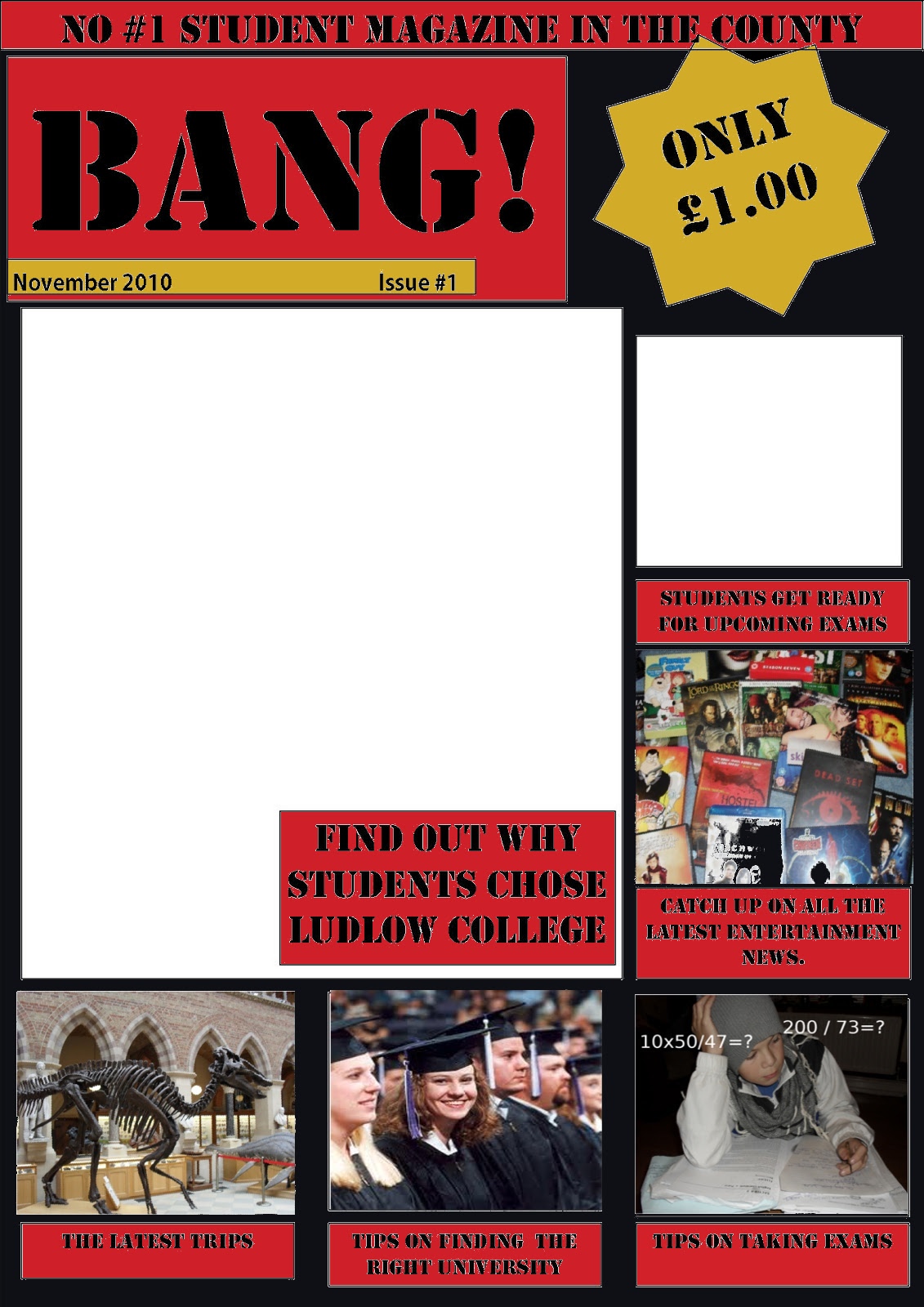
Masthead-I feel that this is a vital as it involves the name and identifies the magazine. My masthead on my front cover worked really well as I used big bold lettering (stencil) in a bold black and I put it in a red box which also helped it to stand out.
Cover lines- I put a load of cover lines in my contents and front cover as I also thought that this is vital, I put cover lines such as “Tips on taking exams” “catch up on all the latest entertainment news” and “new students.” I put these here to advertise what’s inside and make people more interested and buy the product. I feel that these are very good cover lines. To create them I used stencil font in black to link in with the title, I also had a red background to make it stand out.
Images- within my pages I put loads of images, I had a lot of trouble trying to find the perfect ones but I got there in the end. I feel that my pictures worked very well as I edited some on “gimp.” However I feel that there are too much images and if I were to do it again, I would take some away.
Colours- I used the same colour scheme for both my front cover and contents, I thought the colours red, black and gold work perfectly together and compliment each other nicely, however I feel that I should maybe add in more colours.
Editorial- in my conclusion, I added an editorial. I think that this was a good idea as it gives you an introduction to the magazine and says exactly what the magazine involves.
In my magazine, I feel that I added all the main aspects of a magazine and it worked really well. I also feel that its more informative than a normal magazine.
• How does your media product represent particular social groups?
I think that in my magazine, I have represented students and teenagers. I have done this by the ues of stereotypical images, for example… I have images of students who other students can relate to, I feel that pictures of students are extremely vital for a student magazine as it helps the audience determine who the magazine is actually for and what age group. I have also added pictures of movies and TV series that students would be most likely to watch, this would be eye catching to the viewer and make them want to open it and read up on it. Lastly, the language used. I have used language that would appeal to younger audiences and not too complicated words, this makes it more enjoyable and much easier to read for students whereas if it contains long, boring, confusing words it wouldn’t be enjoyable. Also the title is very eye catching and a great word to use for a student magazine “BANG.”
• What kind of media institution might distribute your media product and why?
The distributions that already publish magazines like mine are, magazines like “STUDENT ID” and “ etc.” I got some of my ideas form these two magazines as I thought that theuy were great and helpful, but the student id one never had much information and wasn’t very eye catching, which I made sure mine was. I think that a company would like to distribute my magazine because its eye catching, it offers a lot for students, its enjoyable and its very cheap to buy, which would bring more customers to buy it. I did a analysis on a “student Id” magazine from our college, and I feel that mine was a lot better, as it contained a lot more images and information. I feel that these are the two vital thing for any magazine front cover and contents page.
• Who would be the audience for your media product?
I think that my magazine would be more suitable for students aged 16-18, male or female, as I feel that my magazine provides information for both genders, we have both genders in our college, so I think that both would be more suitable.
• How did you attract/address your audience?
I used a wide range of techniques to attract and address my audience, for example:
Colour- I used bold colours such as red, black and gold. I feel that these colours compliment each other nicely and stand out next to each other, these colours were a great choice.
Text- I feel that the text worked very well as its short and catchy, “Tips on taking exams.” I thought that this worked really well.
Title-Lastly the title, I feel that the title is an important part in catching the readers eye, so I used a big bold stencil font in black. This worked really well.
• What have you learnt about technologies from the process of constructing this product?
To create this magazine cover and contents, I used the following technologies:
Gimp- This was really helpful to change colours and to add in the images.
Digital camera- I used this to take the pictures.
Publisher- I used this to create the layout of the designs.
Within this project, I have learnt so much more about magazines. I have learnt what all the different parts of a magazine is and also how to make your magazine a lot more presentable, appealing and persuasive.
AUDIENCE FEEDBACK!!!
"Really like the colour scheme, very bright and youthful and the colours go well with the pictures"- vcarpenter93
I found this quote very helpful as it told me whatsgood about my design
" I like it, but shouldn't experiment with more fonts." vcarpenter93
I also found this helpful as I did experiment with more fonts and it made it look a lot more presentable.
Conclusion
Overall, I feel that this project was very successful and worked really well, I really like the use of colours and images, also the font is very effective.
If I was to do this again, I would maybe add in less images, experiment more with colours and fonts and try a load of different layouts.

Final contents page :)

This is my final contents page.
Within this I added relevant pictures, a banner, I also added an editorial as i thought that was needed within the contents page...
Sunday, 5 December 2010
colour idea 1
 |
| Please tell me what you think of the first colour scheme Idea Please tell me if you have any other Ideas Thankyou :) |
Image 2
 |
| This is a picture I took for the part "Tips on taking exams." I feel that this is a good picture, but don't think that its good enough so i changed it on "Gimp".... |
 |
| This Is the second version of this image. To change this one I added sums with ?? at the end to show that he is struggling with the questions and to highlight the fact that the tips in this magazine will help a lot. I think that this image works really well and is very effective. |
Images 1
 |
| This Is the first picture that I too and didn't really think that it worked too well as its too far away and its not light enough. |
 |
| So I created another, this one was much closer and I also cropped it so the whole image will be of the DVD's and not any background. I feel that this image goes with the headline " catch all the latest entertainment news." As this contains well know and popular Films and TV series such as The Lord of the rings, The Pirates of the Caribbean, The shawshank redemption, True blood and Family guy |
A few of the pictures on.

I haven't put all the pictures that I have taken on the design yet.
Friday, 3 December 2010
colour scheme!
Im not quite sure what colours I should use and think I should wait until I get more pictures on incase it looks too crowded.
If anyone has any ideas please leave a comment,
Thanykyou :)
If anyone has any ideas please leave a comment,
Thanykyou :)
Wednesday, 1 December 2010
contents page re-done!

I also made the contents headings bigger and made them bolder so that they stand out a lot more.
Post a comment and tell me what you think, nd whether its better than my first draft.
My final draft for my contents page

I really like how this has turned out as it contains a load of information, a editorial and a contents.
If I had to choose something that I dont really like it would be thta there is too much writing.
All I have to do now is get some pictures put them in the boxes and also do the colours, but im not sure what colours I should use....
If anyone has any colour ideas please post a comment and post what you think of this.
Thankyou
Subscribe to:
Comments (Atom)